Web Performance 101
This is an introduction to modern web loading performance. Learn why performance is important, what performance optimizations exist, and which tools can help you understand if your app is performing well.
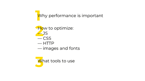
This is what we’ll talk about.

So: why is web performance important?
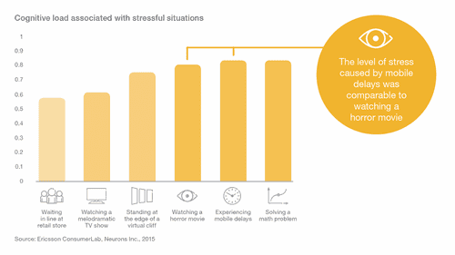
First—a slow site is very uncomfortable. When a mobile site loads slowly, the user experiences stress similar to watching a horror movie.
Image source: Luke Wroblewski
Second—a slow site directly affects your product.
— In 2016, AliExpress increased the speed of their site by a third – and customer orders jumped 10.5%
— Back in 2006, Google slowed down its search results by a half-second – and user requests dropped 25%
— In 2008, Aberdeen Group discovered that discovered that making a site one second slower decreased user satisfaction by 16%
and there’re lots of such data – from both old and recent studies (wpostats.com · pwastats.com).
This is why web performance is important.
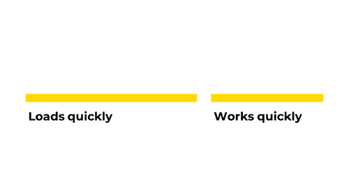
Now, to understand exactly what we’ll talk about, we need to understand what makes a site fast.
A site is fast when:
— it loads quickly,
— and, being loaded, it works quickly (meaning animations don’t skip frames, scrolling is smooth, etc.)
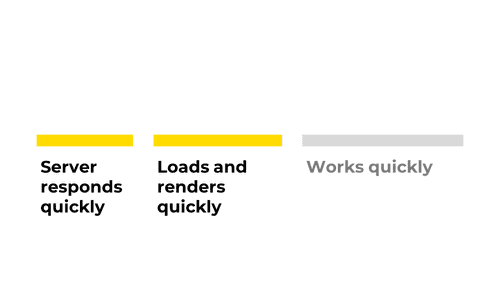
A the site loads quickly when:
— the server promptly responds to requests,
— the app renders quickly
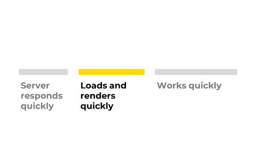
In this talk, we’ll focus on this element—how to ensure that a site loads and renders quickly.
The first element is not relevant – most often, performance problems lie in the second or the third one. The third element didn’t fit into the talk – we’ll probably make another one :) (Subscribe to get notified if/when it’s out.)

So, let’s start with JavaScript. Very often, it’s the slow resource.
![Slide with an example of unminified JS code. The code reads: function logArrayItems(element, index) { console.log('a[' + index + '] = ' + element); } [2, 5, 9].forEach(logArrayItems);](/static/1dd70ff2f2185965e3ce40e0882bc589/86bab/javascript-minification-source.png)
The first way to optimize JavaScript is minification. If you already know about it, skip to the next section.
A typical unminified code looks like this.
![Slide with an example of minified JS code. The code reads: function f(q,w){console.log('a['+w+'] = '+q)}[2, 5, 9].forEach(f);](/static/da7ff9f731c4433b079ea567b5f884f7/86bab/javascript-minification-result.png)
During minification, the code loses all unnecessary characters, receives shorter variable names, and so on. In the end, it becomes smaller but keeps working as intended.
Minification helps to reduce the code size by 30–40%.

Minification is supported in every major app builder:
— mode: production in webpack,
— babel-preset-minify in Babel,
— gulp-uglify in Gulp
Async and defer

Next. So, you wrote a script, minified it, and now want to load it on a page. How would you connect it to the page?
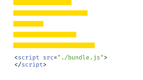
The simplest approach is just to write the <script> tag and specify the path to your file. It’s a fine approach, and it works.
But do you know what’s the issue with this approach?
The issue is that
scripts
block
parsing.
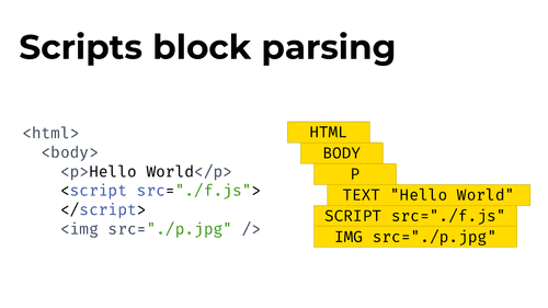
What does this mean?
When your browser loads the page, it starts parsing the HTML document into tags and building a DOM tree. Later, it uses this DOM tree to render the page.
The problem is, a script can alter the way the DOM tree is built.
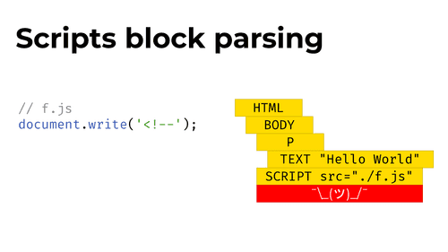
For example, a script can call document.write() and write an opening comment tag into the document. This will ruin the whole DOM tree (and the whole page!) that comes after the script.
That’s why browsers stop parsing when they encounter a script – to keep the document from jumping and to avoid doing additional work.
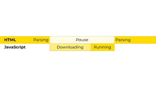
From the browser’s standpoint, here’s how this looks:
— The browser starts scanning the document and parsing it
— At some moment, the browser encounters the <script> tag. It pauses the HTML parsing and starts downloading and executing the script
— Once the script is executed, the browser continues with parsing
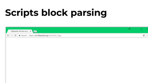
In practice, this means that when you add a script, no content after it will be visible until the script downloads and executes. And if you add a script into <head>, nothing will be visible at all – until the script execution is complete.
Note: modern browsers, in fact, usually try to parse the DOM tree further even if they encounter a <script> tag. This helps to save time in case the script doesn’t modify anything, and the DOM tree doesn’t change. Browsers still don’t show any content after the script though. More on this · Demo
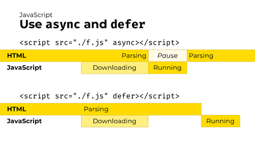
So, what to do? Use async and defer script attributes.
These attributes tell the browser that a script should be downloaded in the background, without interrupting document parsing. Here’s how they work:
— The async attribute asks the browser to download a script asynchronously (in the background) and to execute it as soon as it is loaded. Document parsing will be continued while the script is being downloaded. (If the script downloads before the parsing is complete, parsing will be paused while the script executes, but because downloading a script usually takes more time than parsing a document, this rarely happens.)
— The defer attribute tells the browser to download the script asynchronously and execute it only after the document is parsed.
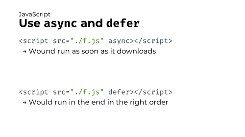
There’s a significant difference between async and defer attributes:
— async scripts are executed as soon as the download occurs, without maintaining the script order. This means that if you have an async React bundle and an async app bundle, and the React bundle is larger, the app will be downloaded and executed earlier than React – potentially breaking the site
— defer scripts, unlike async, would execute in the right order only after the document is fully downloaded. Because of this, defer might be safer than async when optimizing a large complex app.
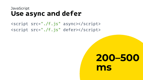
And, as a result, from my experience, these optimizations can strip 200–500 ms (or even more!) off the loading time, depending on your code size and connection. Half a second is actually a lot.
Code splitting
Moving forward.
Applications are often built this way: you compile an app and end up with a big bundle that you send to the client with each request. The problem is that apps often have screens that users would encounter at very rare times –

" e.g., modal windows that open once a month or routes that nobody ever uses. Even though the code from these routes or popups is almost useless, it still takes up space in the bundle and increases loading time."
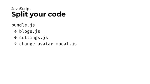
This is usually solved by code splitting – dividing big bundles into smaller ones.
With code splitting, we move different parts of app functionality to different files and fetch them only when necessary. Thanks to this, if a user doesn’t need to open the “Change avatar” modal, they won’t download it at all.
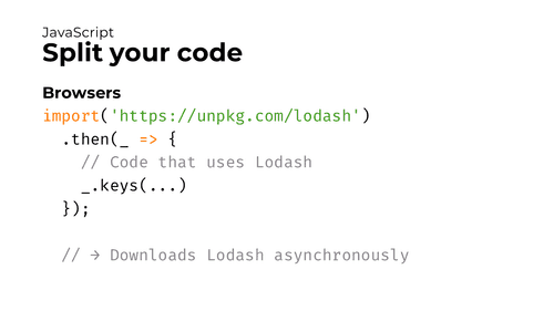
How to implement code splitting?
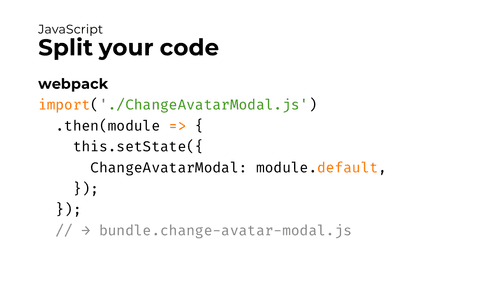
First, you’ll need a bundler like webpack, Parcel, or Rollup. (I’ll mostly cover webpack, because it’s the most popular one.) All these bundlers support a special function called import().
In browsers, import() takes a JS file passed into it and downloads that file asynchronously. It’s useful when you don’t need a library when the app starts, but use it at some point later.
Bundlers, however, treat the import() function differently. If you pass a file name into the import() function and then bundle this code with webpack, Parcel, or Rollup, the bundler will take that file, bundle it and all its dependencies and put the result into a separate compiled file. Thanks to this, the app will only download that file when this import() is called.
On this slide, webpack will bundle ChangeAvatarModal.js (and its dependencies) into a separate file. And, during the execution, it will download this file only when this import() function is called.
This is the actual code splitting.
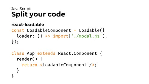
Second, in React and Vue.js, there are helper tools that work with import() and make your job even easier.
For example, react-loadable helps to wait until another component is loaded – and renders a placeholder while it’s loading. React 16.6 added a similar built-in feature called Suspense. And Vue.js has had support for async components for a while.

Well, and data savings from code splitting? Huge.
If done properly, code splitting is the most meaningful optimization in terms of data saving. So:
If you only do a single optimization in your app, make it code splitting.
Refer to these guides to learn more:
— WebFundamentals article about code splitting
— React docs covering code splitting basics
— webpack guide into splitting code
webpack-libs-optimizations repo
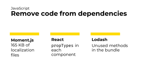
What else could be done? Another important step is to optimize app dependencies.
— For example, Moment.js, a library for working with dates, includes about 160 kBs of localization files for different languages.
— React components keep propTypes even in the production bundle, despite the fact they aren’t necessary there.
— With Lodash, it’s too easy to import and serve the whole library even if you only need a few methods from it.
All these things are the useless code that app dependencies bring into the bundle.
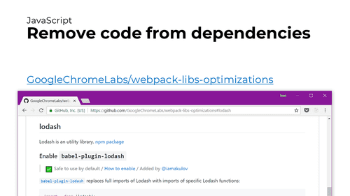
To make developers more aware of this extra code and help them remove it, we (together with Google) made a repository that collects tips how to optimize various dependencies with webpack. Use these tips to make your apps smaller and faster!
All together
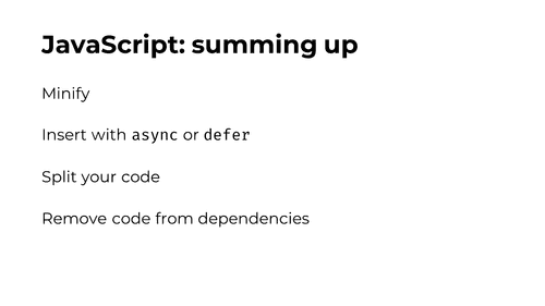
That’s all about JavaScript for now.
Summing up:
— Minify the JS code
— Use async and defer for your scripts
— Split your code to load as few of it as possible
— And remove unused code from your dependencies

Next. Here’s how to optimize your CSS code.
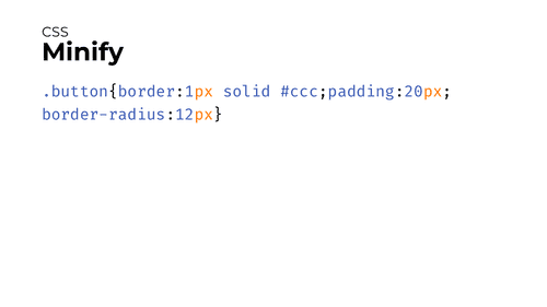
First: minify CSS, just like your JS code. Delete unnecessary spaces and characters to make the code smaller.
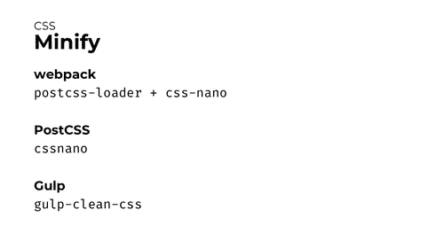
Here are the tools that would help you with this:
— webpack’s postcss-loader with cssnano
— PostCSS’s cssnano
— Gulp’s gulp-clean-css
Critical CSS
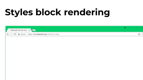
Second: just like JavaScript blocks parsing – styles block page rendering.
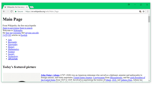
That’s because sites without styles look weird.
If a browser rendered pages before styles were loaded, the user would first see this...
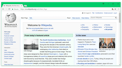
...and then the page would blink, changing to this. Hardly a pleasant user experience.
That’s why the page remains white while styles are still loading.
Now, there’s a clever optimization trick here. It’s perfectly reasonable that browsers keep the page empty while styles haven’t loaded, and we don’t want to get rid of this. However, we can still make pages render faster – by loading the page with just a part of styles needed for initial rendering and fetching the remaining styles afterward. Those styles needed for initial rendering are called “Critical CSS”.
Let’s see how Critical CSS works.
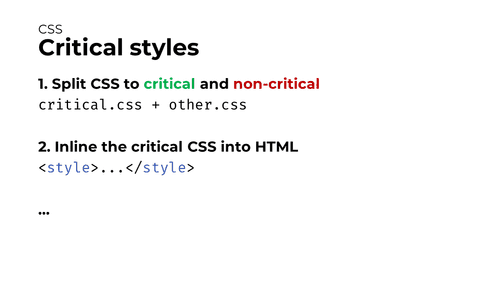
With Critical CSS, the page loading process looks like this:
- You split your styles into critical and non-critical CSS.
- You inline the critical CSS right into the HTML response. This helps to serve it as soon as possible.
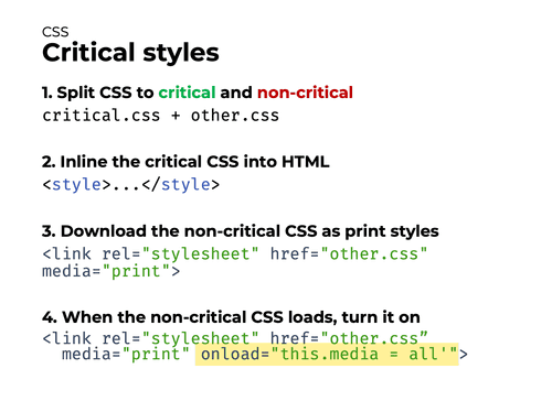
Now, as soon as you serve HTML with the critical CSS inlined, the page could already be rendered. However, you still need to fetch and apply the non-critical CSS.
There are several ways to load remaining CSS, and all of them are hacky, unfortunately. Here’s what I prefer to do:
- You add a
<link rel="stylesheet">to start fetching the non-critical CSS file – but as amedia="print"stylesheet. - And, as soon as the file is fetched and cached, you change the
mediaattribute fromprinttoall. This makes the browser take the cached CSS file and apply it to the document.
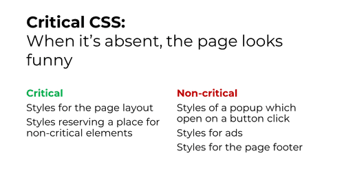
How to understand what to include in critical CSS, and what to serve later? Generally, the rule is:
Start removing styles you think aren’t critical. Keep removing styles until the page starts to look funny or incorrect. The remaining CSS is critical.
For example, styles for the page layout or for the text in an article are critical, because without them, the page will look broken. Styles for a JavaScript popup or for the footer are not critical, because the user won’t see these elements immediately, and the page will look perfectly fine without their styles.
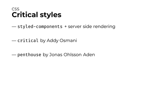
It may seem complex, but, fortunately, there are automated tools that can do it for you:
— styled-components. It’s a CSS-in-JS library that extracts and returns critical styles during server-side rendering. It works only if you write styles using styled-components, but if you do, it works really well.
— critical. It’s a utility that takes an HTML page, renders it in a headless browser and extracts styles for above-the-fold content. Because critical runs only over a single page, it might not work well for complex single-page apps.
— penthouse. It’s similar to critical but operates on URLs instead of HTML pages.
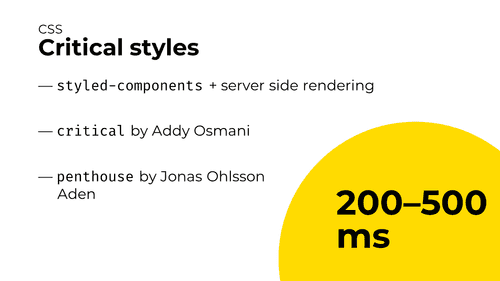
What about performance wins? They are huge. From my experience, extracting critical CSS will shave 200–500 ms off Time to First Paint – or even more!
To learn more about critical CSS, read the amazing Smashing Magazine’s guide.
All together
Those are the primary optimization strategies for CSS. Summing up:
— Minify CSS code
— Extract Critical CSS
Now, let’s move to HTTP and the whole networking stuff.
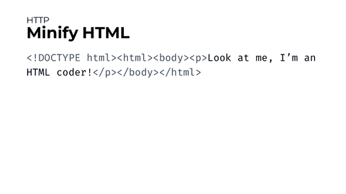
The first approach to transferring less data over the network is, again, minification. Minify HTML documents you’re sending to the client (along with CSS and JS, as we discussed earlier).
Brotli

The second approach to transferring less data is to compress everything you send to the client using Brotli.
Brotli is an algorithm that compresses data you send to the client using a sophisticated archiving algorithm. After compression, your documents will look like an unreadable binary soup, but their volume will be reduced by 60–80%. And when a browser receives the data, it will decompress it back.

If you use a CDN, the CDN is likely already doing Brotli compression for you.
If you don’t use a CDN but run a popular server like Apache or Nginx, you’ll be able to turn Brotli on with just a couple of config changes. Brotli is supported in Apache since version 2.4.26 and is available for Nginx as an external module.
Apache instructions · Nginx module
Note: don’t set Brotli’s compression level to the maximum as it’d make it very slow without significant compression wins. Brotli’s compression level 4 is both faster than the Gzip’s default level and compresses better.
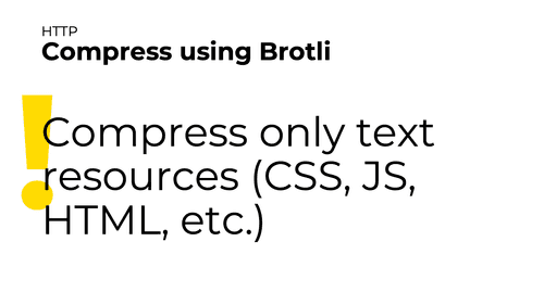
NB: don’t use Brotli for anything but text!
Images, fonts, videos and other binary files are typically already compressed, so compressing them with gzip will not change their size significantly (and would sometimes even make them larger). SVG images are the only exception here.
Gzip
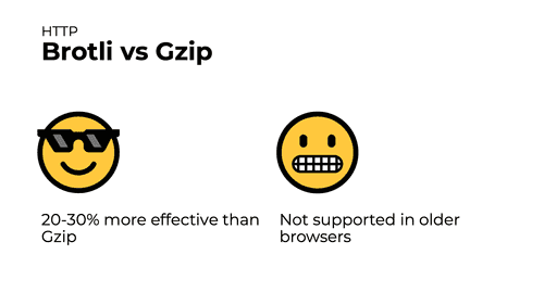
Brotli has an older alternative: a compression algorithm called Gzip.
The upside of Brotli: with the same CPU load, it compresses 20–30% better than Gzip. That’s 30% fewer bytes to download!
The downside of Brotli: it’s not supported in older browsers like Internet Explorer 11. If you need to support older browser, you can’t easily replace Gzip with Brotli – you’ll have to use both at the same time for compression to work in different browsers.
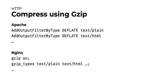
You can enable Gzip with a couple config changes.
CDN
Now, let’s talk about CDNs.
What’s a CDN? Imagine you built an application and hosted it on servers located in the US. If the app’s user is in Warsaw, their request will have to travel all the way to the US and back to Poland. This will take a lot of time because:
— the request will have to travel a long distance (and its speed is limited by the speed of light);
— it will also have to pass through a number of routers and similar devices, and each device will add a processing delay.
This can be justified if the request is made to retrieve the app data, and only that one server in the US knows how to form it properly. However, this is absolutely unnecessary if the user is trying to download an image or a video, because that’s just a regular static content, which can be served by literally any server.
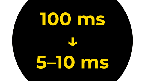
CDN services offer a solution to this problem. CDN stands for “content delivery network”, and CDN services provide a large number of servers to put your static files (the “content”) on around the world. To use one, you register in a CDN service, upload your files, and update the files’ domain in the app. After that, the request of each user is rerouted to a server closest to its location.
In our experience, CDNs typically reduce each request’s delay from hundreds of milliseconds to 5–10 ms. Given the number of requests an app makes when a single page is opened, the effect from using CDN is really wonderful.
Preloading
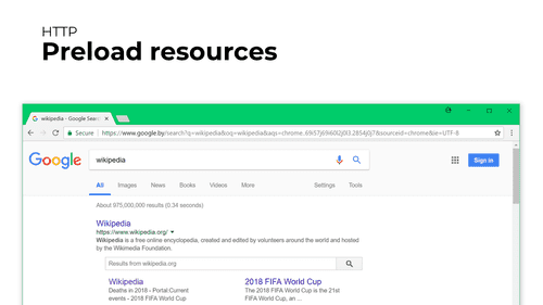
Next. Did you know Google starts preloading the first link in search results as soon as you do a search? That’s because a third of all visitors click the first link, and preloading it allows them to see the target site faster.
If you have pages or resources that you know will also be needed in a short time, browsers let you preload them in advance – just like Google does.
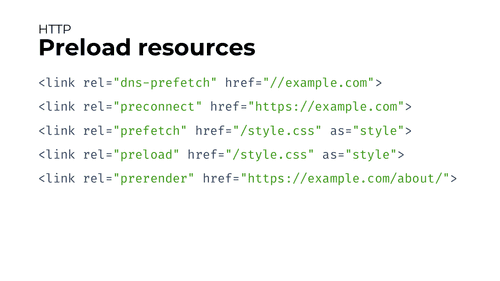
There’re 5 different preload methods, and all are tailored for different purposes.
— <link rel="dns-prefetch"> instructs the browser to make a DNS request for a server’s IP address in advance. This is useful for CDNs, Google Fonts, and for other cases when you know you’ll need a resource in a short time, know the domain it’s hosted at, but don’t know its exact path. In this case, resolving the server’s IP address in advance would save you from 50 to 300 ms.
— <link rel="preconnect"> instructs the browser to perform the connection to a server in advance. It’s useful in the same cases when dns-prefetch is useful, but sets up a full connection and saves more time. The drawback here is that opening a new connection is pretty resource-intensive, so you don’t want to overuse this optimization.
— <link rel="prefetch"> preloads and caches a resource in background with a low priority. This is useful e.g. to preload a JS bundle for the next page of an app.
— <link rel="preload"> preloads a resource in background with a high priority. This is useful to preload a resource you’ll need in several seconds – e.g., a non-critical CSS file.
— <link rel="prerender"> preloads the specified page in the background and renders it in an invisible tab. Later, when a visitor clicks to a link leading to the prerendered page, the page displays immediately. This is what Google uses to preload its first search result.
Note: don’t overuse prefetching methods. Downloading stuff in the background consumes visitor’s traffic – and it’s really bad on mobile. So adding 10 extra preloads might make your app a bit faster, but your visitor will pay real money for this. 2-4 preloads per page are probably fine.
Read more: Preload, prefetch and other <link> tags
All together
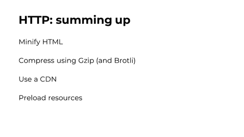
Summing up HTTP/connection optimizations:
— Minify HTML, just like any other resource
— Compress text resources using Gzip and Brotli
— Use a CDN to save time on downloading your static resources
— Preload resources you know you’ll need later

Moving on. Let’s talk about images.
Images take up lots of traffic, but, luckily, don’t block rendering (like JS or CSS code does). Still, it’s better to optimize them too to make them appear faster and use fewer network data.
First and foremost: choose an appropriate format for each image. There are different image formats, and they work best with different types of images.
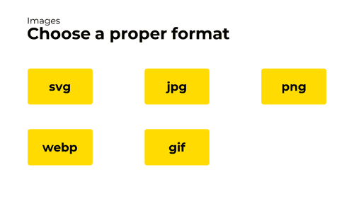
The most common formats are svg, jpg, png, webp and gif. Here’s how to choose between them.
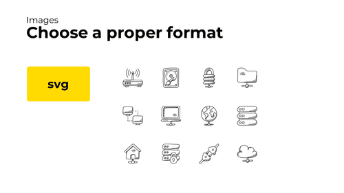
svg is best for vector images such as icons or logos.

jpg is best for photos because it compresses images with a slight quality loss not visible by the human eye.
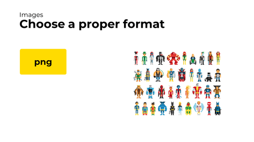
png is best for raster graphics that you want to display without any quality losses – e.g., raster icons or pixel art.
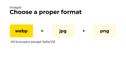
webp works great for both photos and raster graphics because it supports both lossy and lossless compression. It also compresses at least 20-30% better than jpg and png (jpg study · png study).
Unfortunately, webp is not supported in Internet Explorer and older Safari versions. However, you can still load webp images with a jpg or png fallback using the <picture> tag.
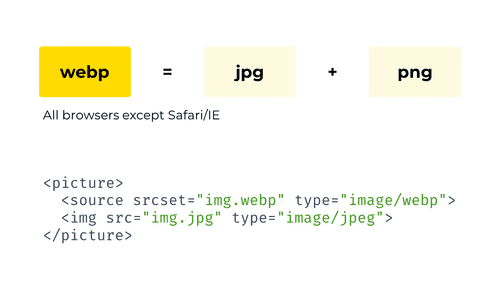
This is how a <picture> tag for webp with a jpg fallback would look like.
With such tag, browsers that support webp will load the webp file. Browsers that don’t support webp or the <picture> tag will fall back to the plain jpg image.
And, finally, gifs.
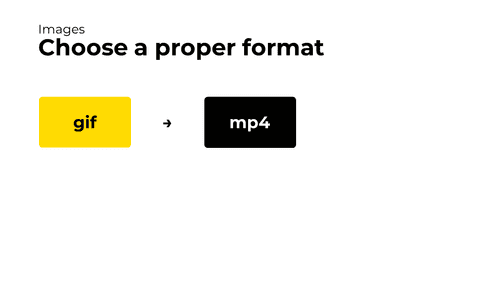
Don’t use gifs at all. gifs are massive – too often, they take megabytes or tens of megabytes of data. Instead, use video files (with the <video> tag) which compress the content more effectively.
See also: Replace Animated GIFs with Video at WebFundamentals
Image compression
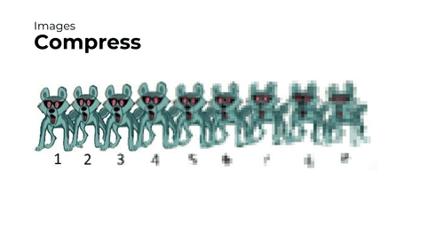
Besides using the right format, pictures can be optimized with compression. Here’s what you can do with different image types.

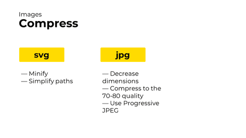
First: svg.
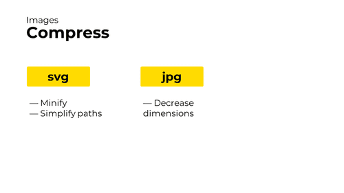
— Minify. Since SVG images are text, they can be minified by removing comments and spaces.
— Simplify paths. If an SVG file is automatically generated or exported from a graphical editor, paths in it can be overly complicated. If such cases, remove path points that don’t affect anything visually.
— Simplify file structure. If an SVG file is exported from a graphical editor, often, it also includes extra meta elements. Remove those to make SVGs smaller.
All these optimizations can be automated with a console utility called svgo. There’s also a great UI for svgo.
Second: jpg.
— Decrease image dimensions. From my experience, this is an incredibly common mistake that happens with photos.

The problem occurs when you have a high-dimension picture – say, a 2560 × 1440 px photo – that you put into a small container – say, 533 × 300 px.
When this happens, the browser has to download an unnecessarily large file. Moreover, it then has to spend time scaling that file down to lower dimensions. That’s just meaningless.
To fix this, scale down your images in a graphics editor like Photoshop or Gimp, with a webpack loader (e.g., responsive-loader), or using another tool. If you need high-dimension pictures for HiDPI screens, use <picture> or <img srcset> instead.
Next.
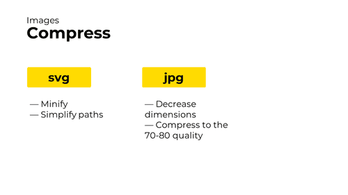
— Compress your JPG images with the compression level of 70‑80. The thing here is that, down to some compression level, a quality loss is just not noticeable.

For example, here’re three different versions of the same JPG image: with level 100 quality, level 70 quality, and level 50 quality.
Original images: level 100 · level 70 · level 50
Photo by Bruce Hong on Unsplash

If you zoom into the pictures, you’ll see noticeable compression artifacts and detail loss only at compression level 50. Compression level 70 still eats some of the image details, but it’s much less visible.
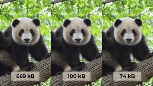
But what’s dramatically different about the versions of the image is their size. The level 70 image is almost 7 times smaller than level 100 image – keeping practically the same level of details!
That’s why you want to compress JPG images with level 70-80. With that level of compression, the quality losses are insignificant, but the size gains are incredible.
To compress JPG images, use a graphics editor like Photoshop or Gimp, a webpack loader (e.g., image-webpack-loader), or another tool.
Next.
— Use Progressive JPEG. Progressive JPEG a kind of JPG that starts rendering in poor quality but improves as the image’s being loaded.

E.g., this is how a non-progressive (baseline) image usually loads when the network is slow. It just slowly renders from top to bottom.
Gif source: Progressive Image Rendering by Jeff Atwood

A progressive image, however, starts rendering with a smaller number of details and enhances during loading. Thanks to this, a visitor can roughly see what’s in the image way earlier.
To make an image progressive, use a graphics editor like Photoshop or Gimp, a webpack loader (e.g., image-webpack-loader), or another tool.
Note: progressive JPEGs don’t come for free. They’re slower to decode, and they can be larger than the same baseline images. Read more in images.guide by Addy Osmani.
Gif source: Progressive Image Rendering by Jeff Atwood
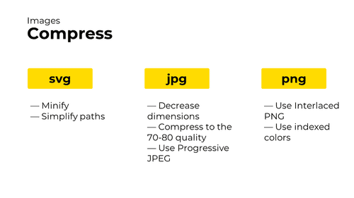
Third: png.
— Use Interlaced PNG. Interlaced PNG works the same way as Progressive JPEG: it starts rendering in a low quality but improves as it loads. It’s not suitable for everything – e.g., loading PNG icons progressively would look weird – but it might work for some images.
— Use indexed colors. With indexed colors, a PNG image puts all its colors into a palette and uses it to reference each color. This makes the number of bytes needed for each pixel smaller and might help to decrease the overall image weight. Because the palette size is limited (up to 256 colors), this solution doesn’t work for images with lots of colors.
Both interlacing and color indexing can be enabled with a graphic editor, image-webpack-loader, or another tool.
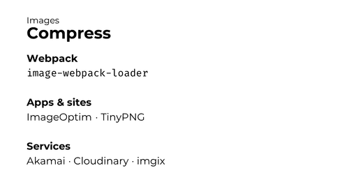
And all of the above can be automated! I’ve already mentioned some tools earlier. But to sum up and add some more:
— webpack has image-webpack-loader which runs on every build and does pretty much every optimization from above. Its default settings are OK
— For you need to optimize an image once and forever, there’re apps like ImageOptim and sites like TinyPNG.
— If you can’t plug a webpack loader into your build process, there’re also a number of CDNs and services that host and optimize images for you (e.g., Akamai, Cloudinary, or imgix).
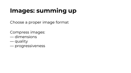
That’s all about images. Summing up:
— Choose the proper image format
— Optimize image loading time by decreasing their dimensions, decreasing their quality, or making them progressive
To learn more about image optimization, check:
— images.guide by Addy Osmani
— Responsive images on MDN
— How to optimize images in webpack by Ivan Akulov (the talk author)

And the last part of web performance optimizations we’ll talk about is fonts.
When you browse the web from a slow connection, sometimes, there’re cases when a page has started loading, the layout and pictures are already visible, but the text is absent for a few more seconds, like on the video.
This happens when the page has custom fonts. On such pages, browsers usually don’t render the text immediately. Instead, they wait for a few seconds for those fonts to load to render the text with them. Only if a font doesn’t download after several seconds, they use the fallback font.
This behavior of not showing the text is often reasonable as it prevents the flash of unstyled text (jumping of text that happens when one font is replaced with another). But in slower networks, this behavior makes users wait. And it’s undesirable.
Let’s see how to optimize fonts to avoid this.
Fallback fonts
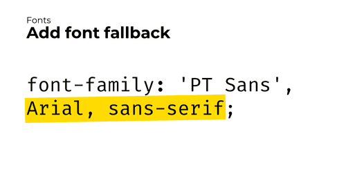
First. Remember to specify the fallback font.
A fallback font is a font that the browser uses if the primary font can’t be downloaded or if it takes a while to load. It’s specified in the font or font-family CSS declarations after the custom font name.
A fallback font might be a popular built-in font (like Georgia); it might be a generic font family (like serif or sans-serif); or it might be both. Generally, even if you specify a popular built-in font, you should still add a generic font family – because even that font might be absent on some devices.
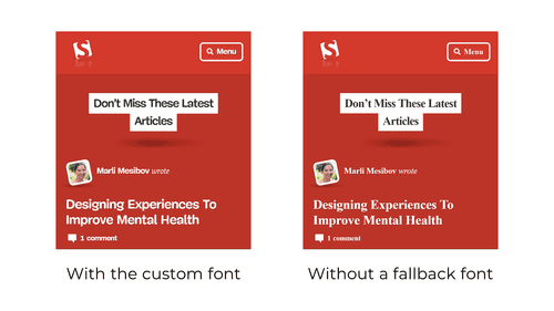
Without the fallback font, if a custom font isn’t available, the browser will render everything in the default serif font. And this might not look good.
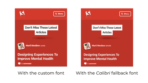
With the fallback font, however, you have a chance to specify the font that resembles the custom one.
font-display
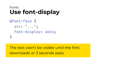
Second. Use the font-display CSS property for your custom fonts.
The font-display property adjusts the way a custom font is applied. By default, it’s set to auto, and in all major browsers, this means the browser will wait 3 seconds for the custom font to download. This means that if a network is slow, the visitor will have to wait for the text for another 3 seconds.
This is bad. To optimize this, specify a different font-display value.
Note: in Microsoft Edge, the font-display: auto behavior is different. With it, if the custom font is not cached, Edge immediately renders the text in the fallback font and substitutes the custom font later when it’s loaded. This is not a bug because font-display: auto lets browsers define the loading strategy.
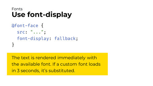
There’re two font-display values that I believe are suitable in most cases.
The first one is font-display: fallback. With it, the browser will render the text immediately with the available font: either the custom font if it’s cached, or the fallback font. Then, if the custom font isn’t cached, the browser will download it. And, if the custom font downloads quickly enough (usually in 3 seconds), the browser will swap the fallback font with the custom one.
With this behavior, sometimes, the user will see the page in the fallback font, start reading, but then the browser will flash the text by substituting the custom font (see also: the flash of unstyled text). This is slightly worse for the user experience, but it’s still better than not showing any text at all.
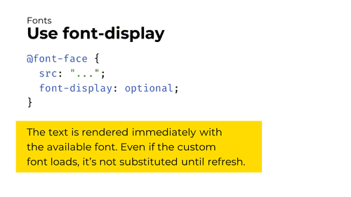
The second suitable font-display value is optional. With it, the browser will also render the text immediately with the available font: either the custom font if it’s cached, or the fallback font. But then, even if the custom font downloads, the browser won’t substitute it until the page is refreshed.
This behavior means that the user will only see the page in the custom font or in the fallback one, but will never experience the flash of unstyled text.

How to choose between font-display: fallback and font-display: optional?
I believe it’s a matter of taste. I, personally, prefer to keep my text rendered with the custom font, so I choose the font-display: fallback value. If you’re OK that first-time visitors will see your page in a fallback font, font-display: optional would work great for you.
Note: this font-display trick is not applicable to icon fonts. In icon fonts, each icon is usually encoded by a rarely used Unicode character. Using font-display to render icons with a fallback font will make random characters appear in their place.
Read more about font-display: CSS-Tricks article · demo of different font-display values
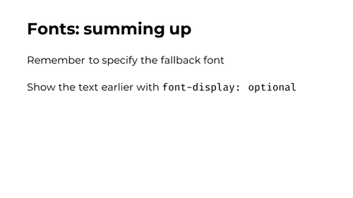
That’s it about fonts. Summing up:
— Specify the proper fallback font (and a generic font family)
— Use font-display to configure how the custom font is applied

Hooray, finally, tools! Here’re some instruments that will give you insights into the app’s performance.
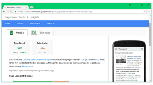
The first tool is Google PageSpeed Insights.
PageSpeed Insights run a number of audits over the URL you give it. They analyze page resources, find optimization suggestions, and calculate your performance score.
If you only start with web performance, this tool will work the best for you. Aim to have the PageSpeed score of 80 or higher.
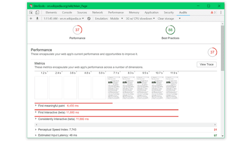
The second tool is Lighthouse.
Lighthouse is PageSpeed Insights on steroids. It has several audits (including performance, SEO and accessibility). It calculates multiple metrics and outputs even more performance suggestions.
Unlike PageSpeed Insights (which run as a standalone site), Lighthouse is built into Chrome DevTools. This means you can use it even for a non-publicly-accessible app!
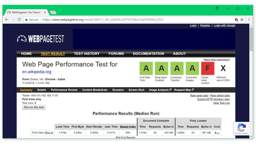
The third tool is WebPageTest.
WebPageTest is an advanced auditing tool. It analyzes a site performance and outputs a huge number of data like metrics, loading waterfall, content breakdown, and more. It’s useful when doing complex optimizations.
And the last tool is webpack-bundle-analyzer.
webpack-bundle-analyzer is a webpack utility that visualizes your bundle content. It’s extremely useful to understand what takes size in your bundle and what you can optimize. Read more about how to use it at WebFundamentals.
That’s it about tools – and about the talk!
Video source: webpack-bundle-analyzer docs
More tools: iamakulov/awesome-webpack-perf

Thanks!
Follow me on Twitter: @iamakulov
Thanks to Arun, Anton Korzunov, Matthew Holloway, Bradley Few, Brian Rosamilia, Rafael Keramidas, Viktor Karpov, and Artem Miroshnyk (in no particular order) for providing feedback on drafts.

Performance articles, case studies, and more. A new email every once in a while: